“Just What Is It That Makes Today’s Homes So Different, So Appealing?” - Process and Thoughts
Richard Hamilton as Inspiration - Description and Analysis
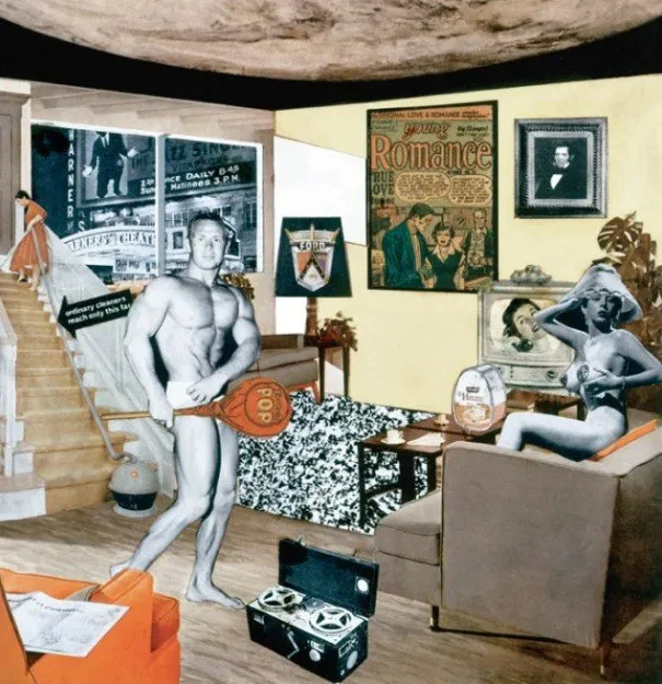
Richard Hamilton, “Just what is it that makes today’s homes so different, so appealing?”; 1956
Released in 1956, this work by Richard Hamilton is a seminal and early work of pop art. Although making collages with magazines wasn’t new, the source material, the subject matter, and the era that Hamilton made this in certainly were. That source material, mostly from print magazines, was embracing and promoting a fierce and joyous consumerism after WWII, where buoyant optimism of capitalism’s renewed promise merged with technological advances made accessible to every consumer. Give me more mass production please and thank you!! Subject-matter wise, we have some figures in black-and-white who are in traditional contrapposto and reclining nude poses, tenants of Western art history, but unlike their Greek and Roman counterparts are photographs of exaggerated, live human beings instead of myths portrayed in marble. It’s an era of “Romance”, “daily” activities, and “pop” that exists in and outside of the home, where the excitement of the television is almost dwarfed by everything else inside the room we can see, let alone what we can see just outside the window. Oh how I wish I could sit in this orange chair in the left corner. Did you even see it at first? It looks so smooth.
Practically seventy years later, I re-encountered this image, having loved it and forgotten about it previously. When I first saw it I was singularly drawn to that “pop”-ness, but it feels quite dense to me today. I now perceive an almost forlorn and destitute core of emptiness in it. Our two main characters are in black-and-white, void of any spice of life seen most apparently in the orange splashes throughout the image. And while both appear to be white, have exaggerated features of sexual prominence with bodies cheating out towards each other, and are in a well-adorned, bohemian space, they’re not together. Why is he looking right at us? Is she posing towards the viewer too? And while the orange color sticks out, the tepid yellow of the wall and layers of beige throughout the rest of the image aren’t exactly what we’d call “pop” today, where competition to hold our attention is taking visuals to new extremes of color and frenzy. Most interesting to me is what looks like a moon instead of a ceiling (the black border around it adds to my reading of it being the moon a lot). What the fuck! It literally blows the roof off the composition, and although I can espouse about the beauty of the moon generally, here it looms heavily across the length of the image and connotes something foreboding and unnerving.
Like how Hamilton’s perspective informed the choices he made, so too do I feel informed by the world today to analyze and project thoughts through this image. We are still on the same track of self-congratulatory capitalism, but that 1950’s-optimism is now a wag-of-the-finger decree arguing about its own necessity. Sure we have new technology, but it’s all now thinly-veiled evils: Designed obsolescence, online spending and credit card debt, and goddamn motherfucking AI have overtaken the markets of our shelves and our minds. Like the distance between these two black-and-white figures, the internet distances us from genuine relationship and community building, where algorithms that profit from division determine our means of connection and activism. More than ever we are immersed in media and IPs, where the novelty of a television in the home in Hamilton’s work is now a habitual requirement of a “television” in our pockets, on our wrists, and always in front of our eyes, both unable to be turned off and unwilling to be removed.
Like other artists through the years, and even Hamilton himself, this thing excited me and led me to want to make something. I don’t mean to copy or re-articulate Hamilton’s work in any way, and was only interested in making something based on what I perceive in his work: Gratifying pop pleasure with underlying emptiness and banality.
2. My Work
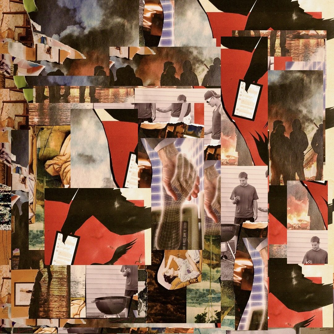
Jackson Rhodes, “Just What Is It That Makes Today’s Homes So Different, So Appealing?”; 2026
You might not enjoy the music I made, and ain’t nothin wrong with that. I set out to make something that wasn’t pleasing and instead invokes particular feelings, at times satisfying and gorgeous and at times overwhelming and gross. I’ve also realized through making this that I just can’t shake the urge to make things sentimental, sappy, and conventionally “beautiful”. Like clay on a wheel, this thing transformed over the past few months as I approached it with different intentions from different sources with different outcomes and different revisions. So while I have certainly reached a point that I have to release this before threatening to over-work it even more (while it’s also simultaneously under-worked), I love that process and really enjoyed making this.
The cover art is a collage I made of images from New York Times pictures, pages from a magazine called In Formation, Hieronymous Bosch images, and various other knick-knacks I picked up around the block. I use children’s scissors and Elmer’s glue to put my collages together because it’s fun and I am a child. I then found an Image Fragmenter, made by Grace Manning, to splice it in ways that evoke mass-production, randomness, and other things like that. Ultimately I just think it looks neat.
For the best listening experience, I recommend putting this on after you’ve thrown up at a party but only thrown up just enough to still be chill while the host is projecting 1960s advertisements on the wall along with Mark Carney’s speech at Davos, and the boy you’ve been crushing on is suddenly nowhere to be seen. Oh and please have Instagram Reels, TikTok, or several Twitch livestreams playing on mute on the side too.
- Jackson